Unbounded future
- Project created by FIC DESIGN,
- won 2024, Silver
- from Commercial Space & Exhibition
“We wanted the space to be both personal and inclusive. It can not only interpret the brand pattern and tone, but also meet different business needs.”
— It has been designed
This case is a shoe brand showroom space, for designers, how to maintain the personalized characteristics of the structural appearance in a “product display” and “business negotiation” as the center of the space, while not distracting, is an important consideration of the design direction.
01
Two-way interactive relationship
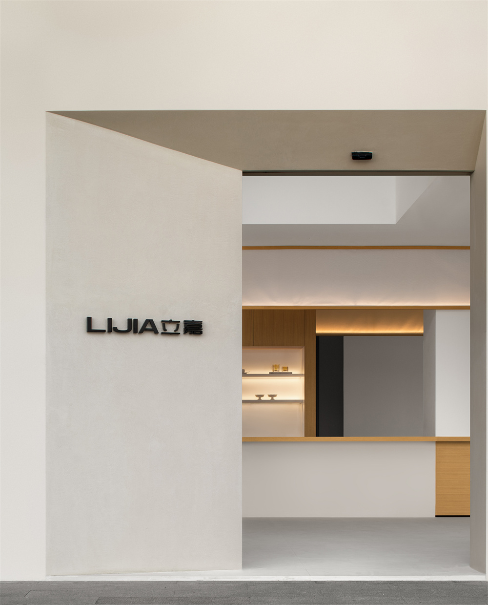
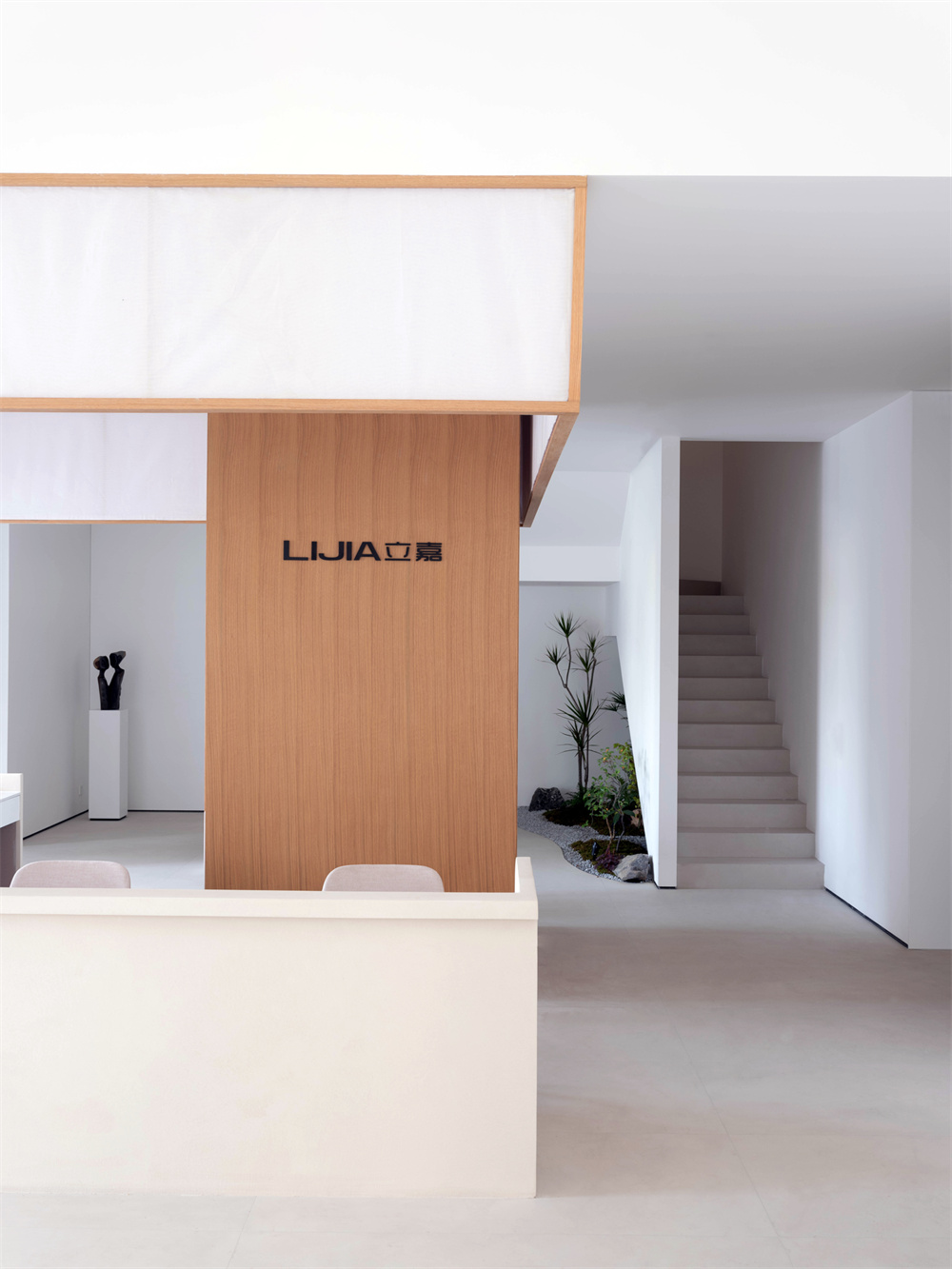
The project has two entrances, one facing the river and close to the parking lot, with impeccable views and light; The other is located in the corridor of the commercial area, where more visitors will enter. After much thought and consideration, the designers decided to keep two entrances at the same time.
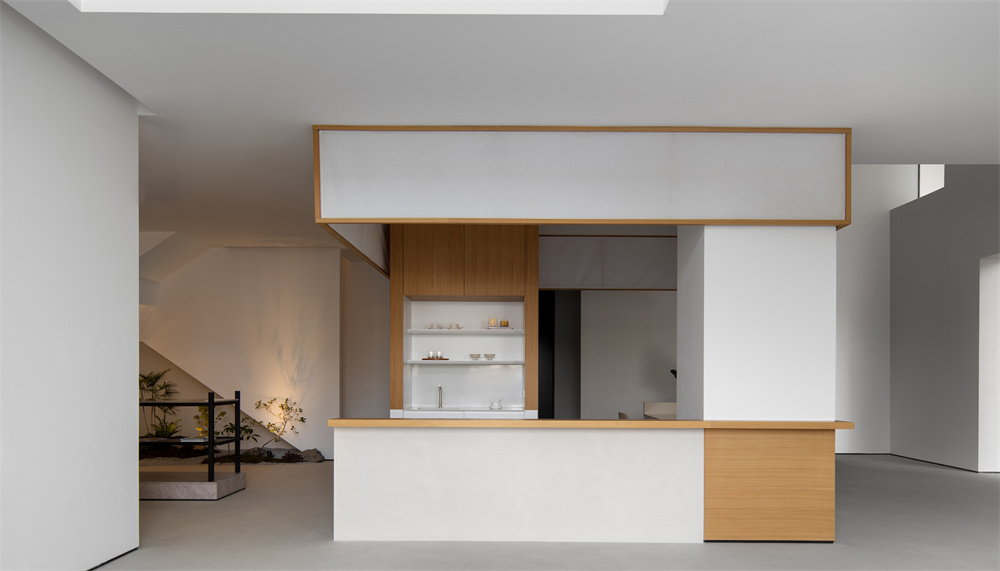
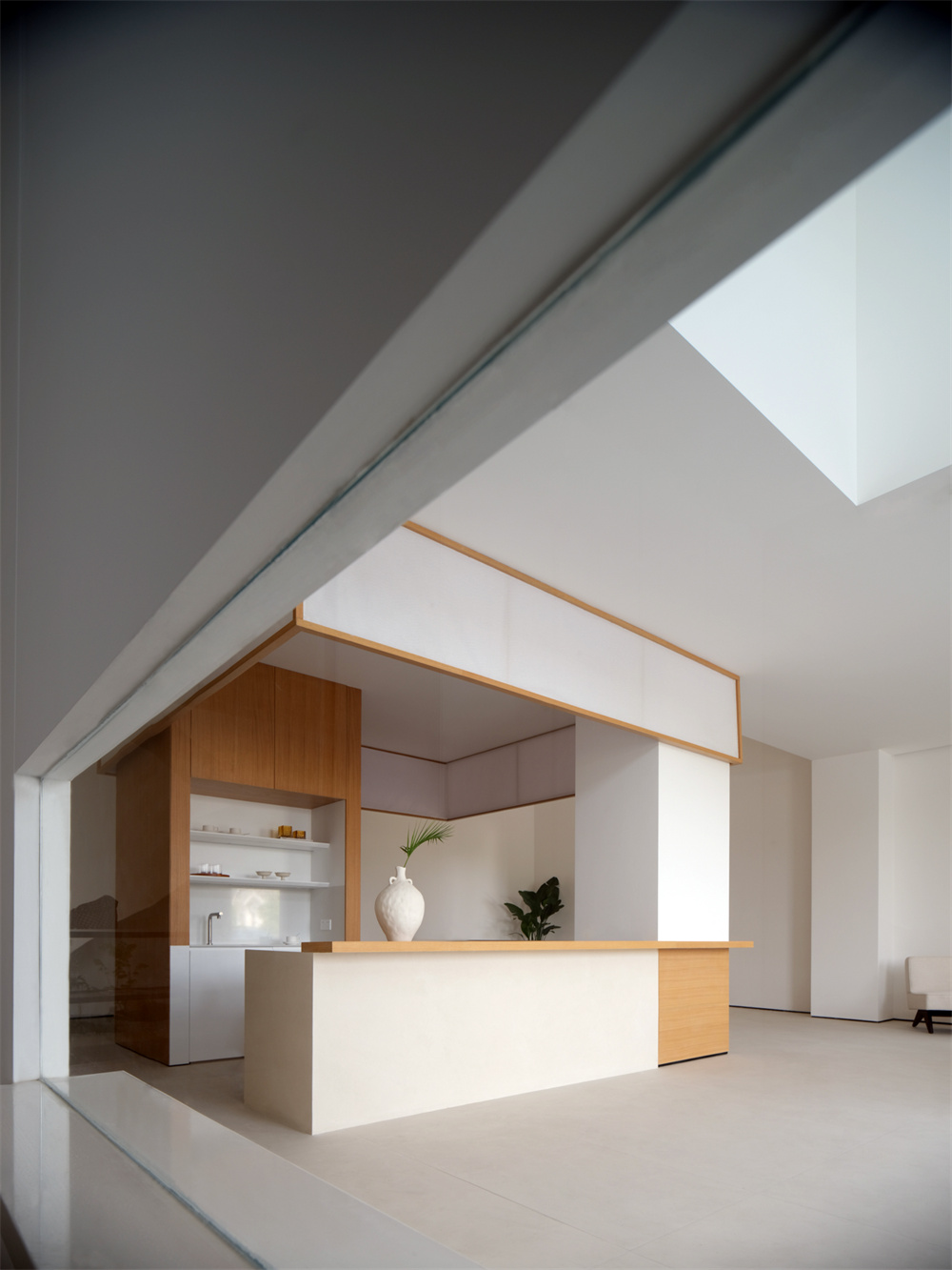
In order to accommodate the two-way flow of people, the front desk area is placed in the center of the space to cope with different scenes, while the zigzagging lines naturally gather people from different directions.
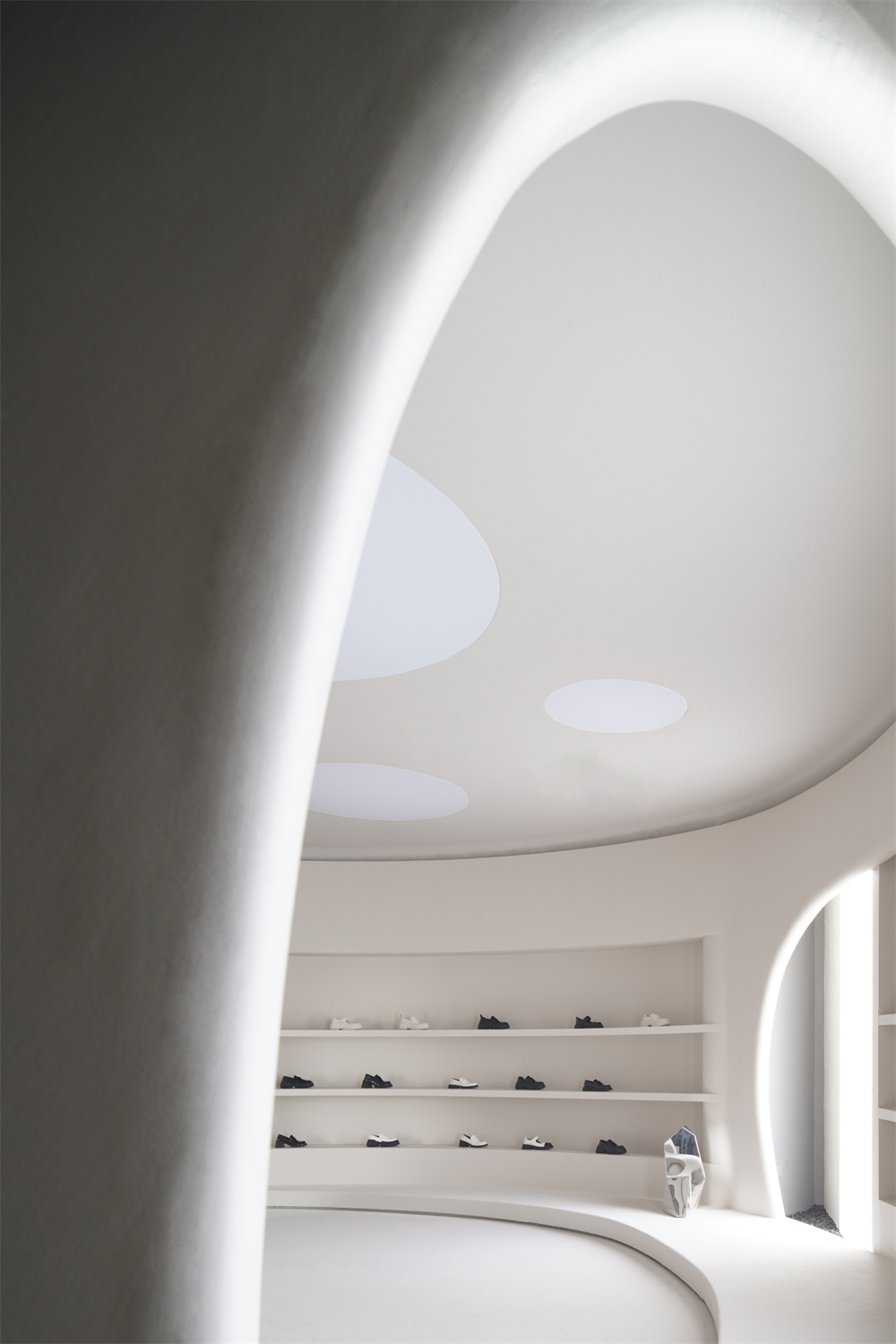
The roof is partially lifted, creating a sense of space extending upward and creating an initial impression of openness and clarity.
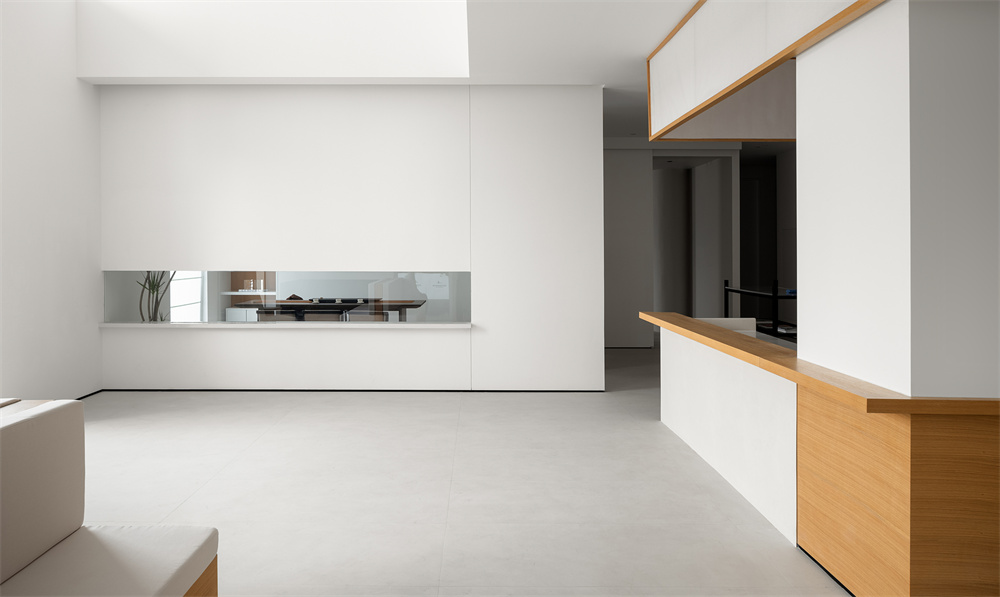
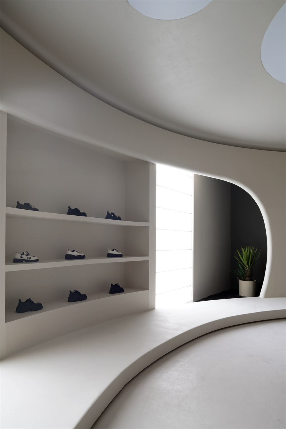
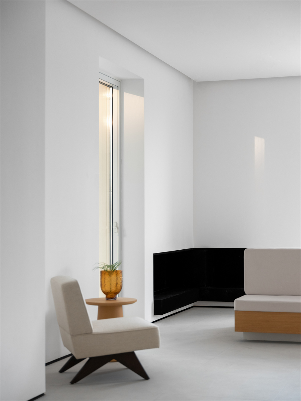
The interior abandoned almost all artificial decoration, only through the intentional cutting of doors and Windows, the introduction of the external river view became a part of the interior decoration, injecting smart vitality into the architectural space.
02
Curved lines that contradict each other
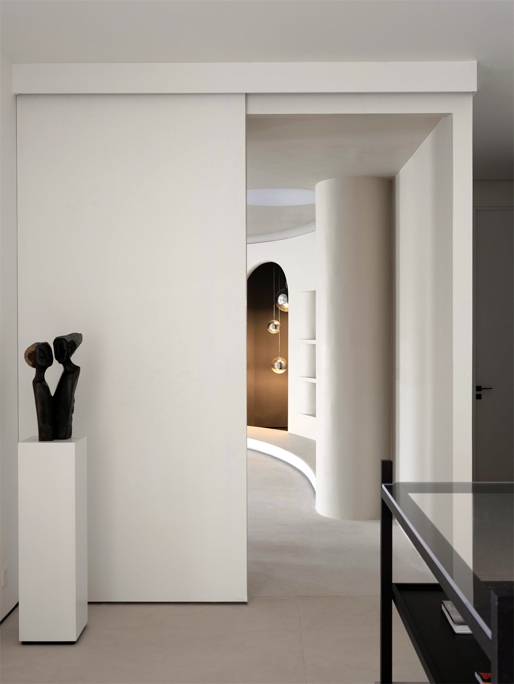
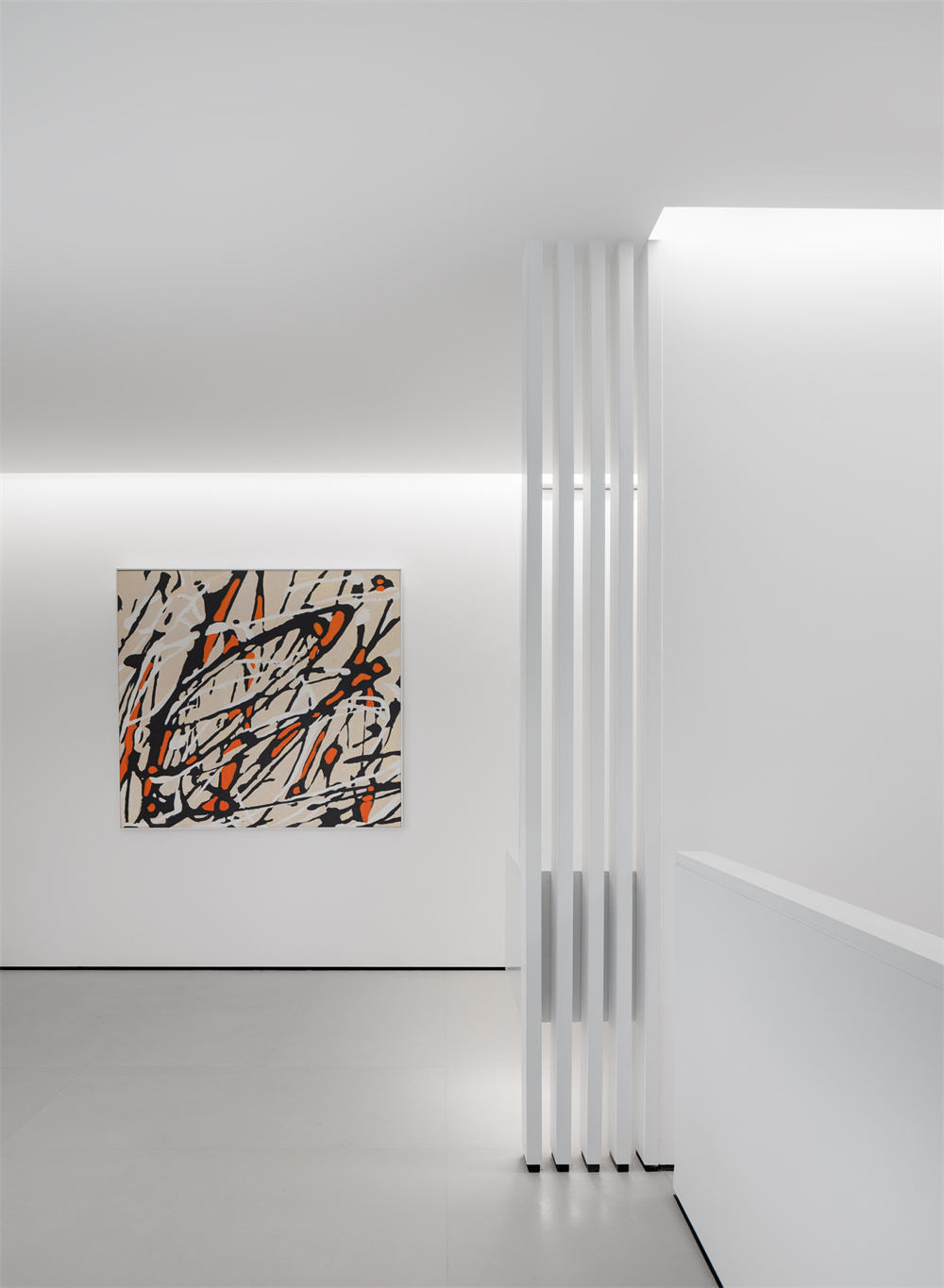
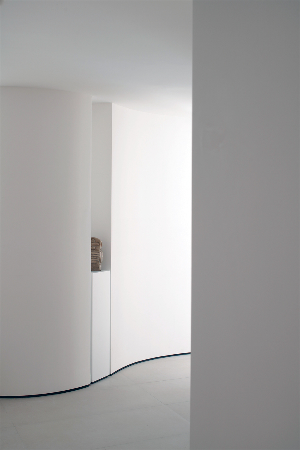
In addition to the reception area, the first floor also has a display function. Add curved lines in the horizontal and vertical space to soften the sharp sense of angular space, and the pure white bottom is to better show the original charm of space. The case uses art paint as a whole to create a soft texture, and the light pouring in through the window creates a symbiotic experience of brightness and shade.
Through the pure white structure, the designer creates a futuristic dream space for the shoe brand. Through the distinctive geometric blocks, the designer forms layers of progressive scene metaphors, leading people into the spiritual world of the brand.
03
A sense of coordination at the three-dimensional level
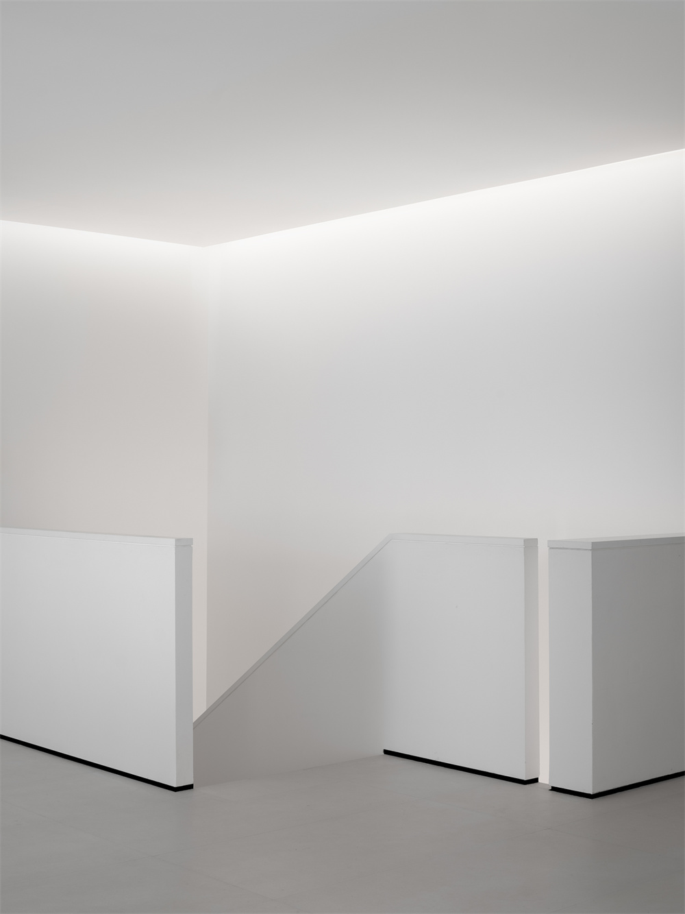
The arc of the second floor echoes the visual elements of the first floor, forming the overall sensory continuity.
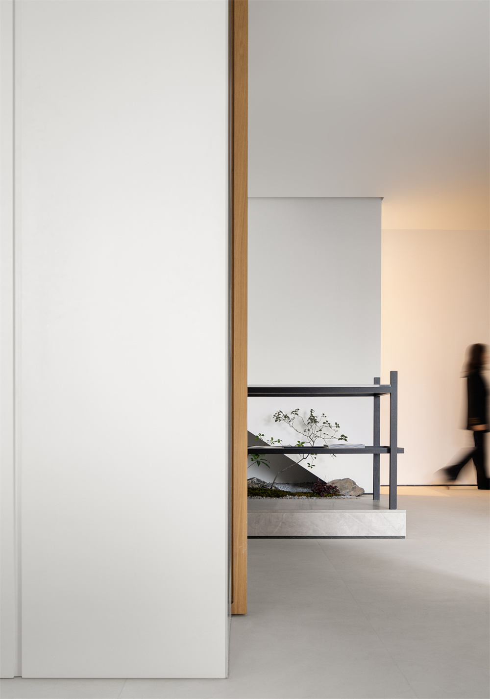
As a relatively introverted space, the design style has gradually changed from rationality to sensibility, with the same white base, abandoning the sharp and bold building blocks, and changing to the exploration of space atmosphere.
04
Take practicality as thinking logic
Design believes that no matter the external form of space is individual or conservative, its most important underlying logic is the grasp of practicality.
Based on the specific use of the scene after thinking, planning the layout and moving lines of the space, thinking about the characteristics of different building materials in use, the rest is the icing on the cake.
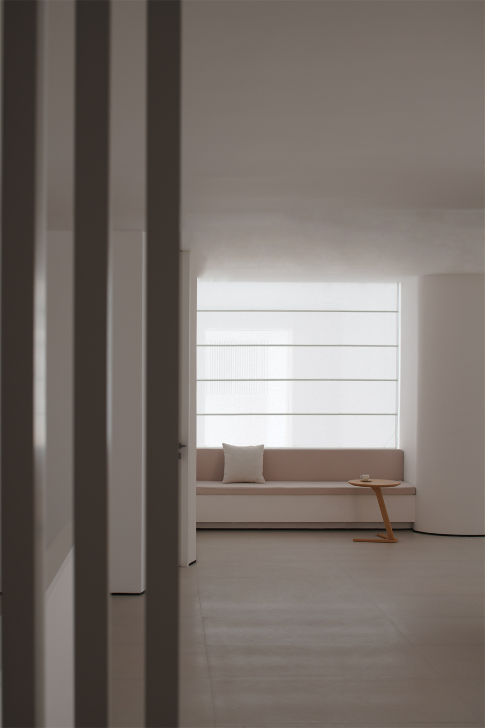
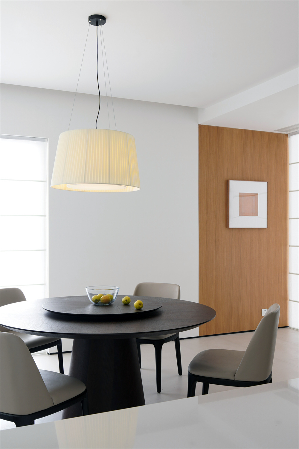
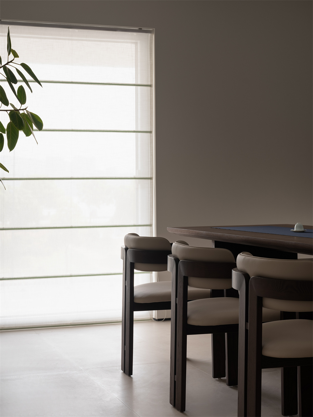
Back to the project itself, in the consideration of the layout of the second floor, the restaurant area used for hospitality is set near the river with the best view effect, and at the same time, it is linked to the empty area at the entrance of the first floor to achieve a three-dimensional interactive relationship from the plane to the facade.
In this way, in the process of dining, in addition to the static visual feeling brought by the river view, the dynamic scene interspersed with pedestrians entering the space, between the static and static, the space also becomes rich in rhythm and vitality.
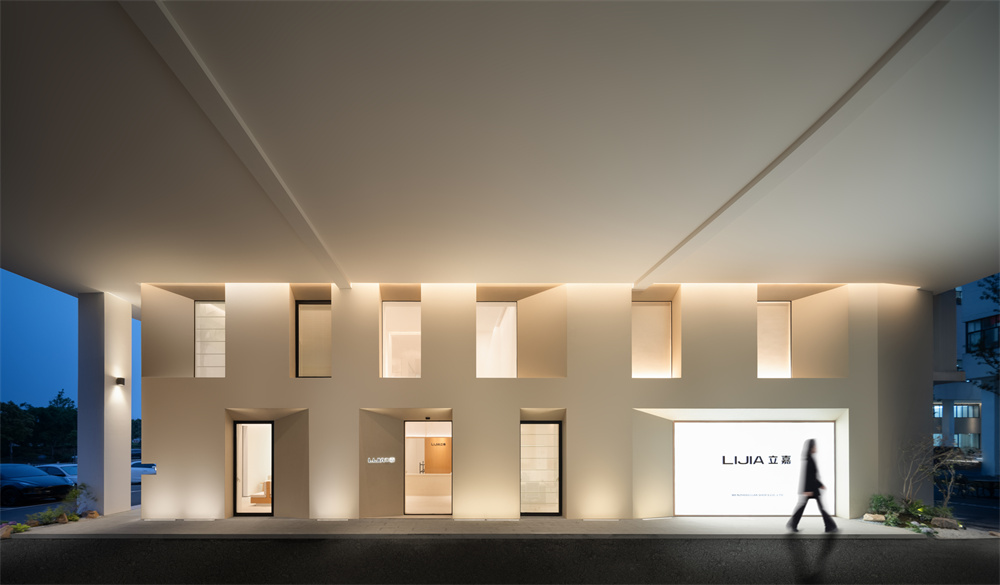
For the facade of the space, the design hopes to achieve the effect of young personality.
A large area of white art paint is laid out to form a pure core of the space, weakening the sense of boundary. Light is reflected through the glass, like a building from the future jumping into the dark night, causing pedestrians to stop and approach curiously.
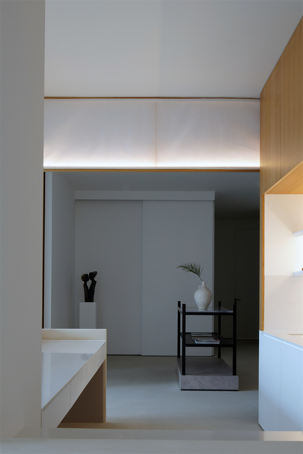
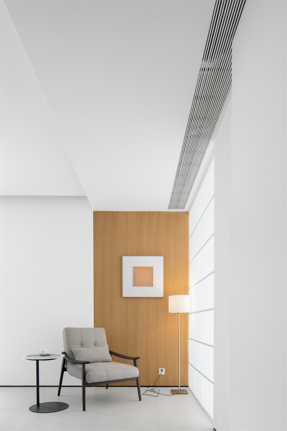
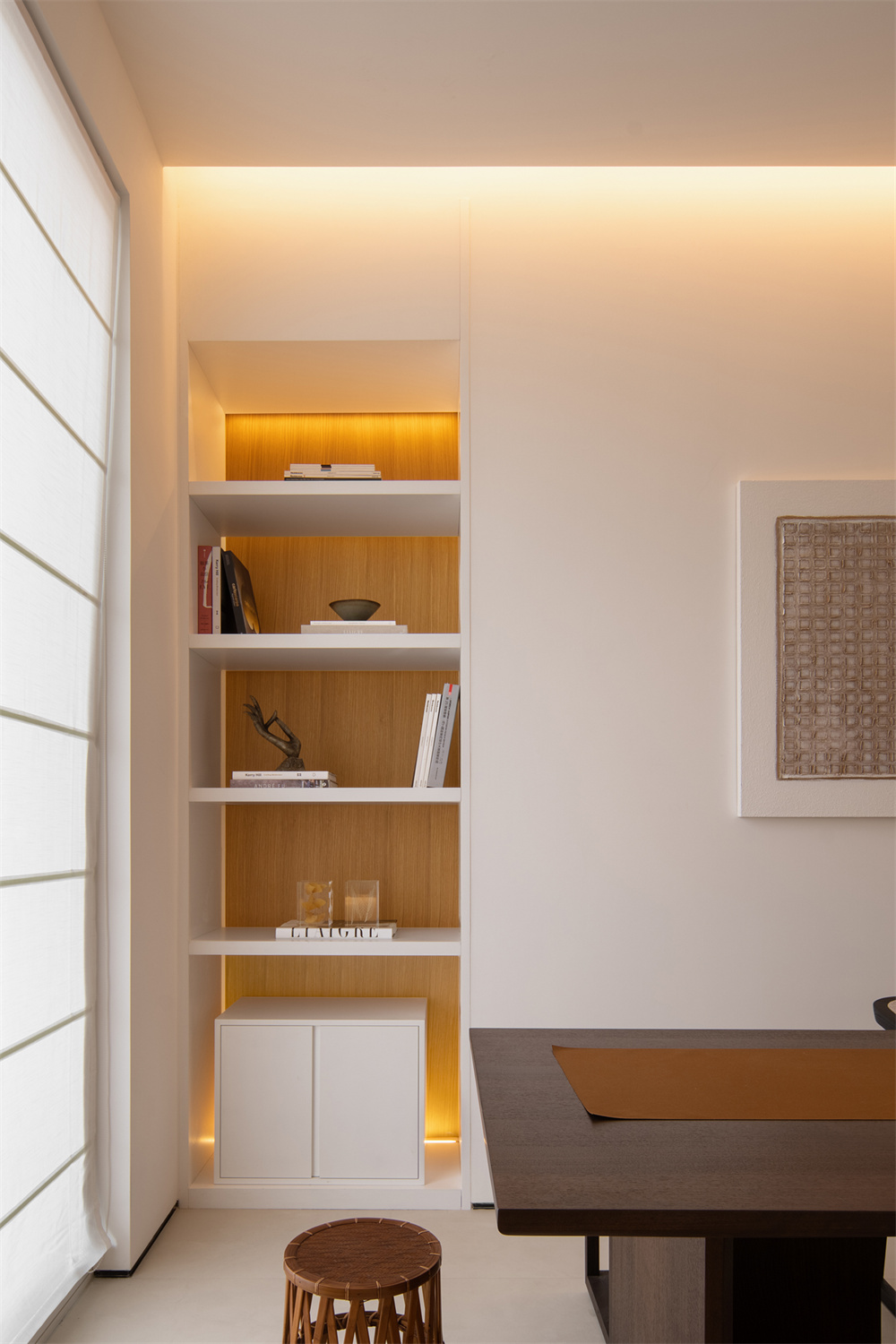
In the space combining the dual attributes of exhibition and office, the design does not blindly place a large number of elements to fill the space, but weakens the color and decoration as much as possible, concentrating people’s attention on the architecture-like structure itself.


About FIC DESIGN
Luo Wenjie
FIC DESIGN Design director