LIgne Roset Exhibition Hall
- Project created by Chongqing Micro Interior Design Co., Ltd.,
- won 2022, Innovation
- from Commercial Space & Exhibition
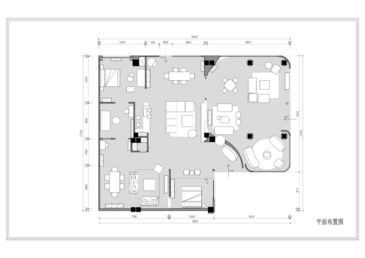
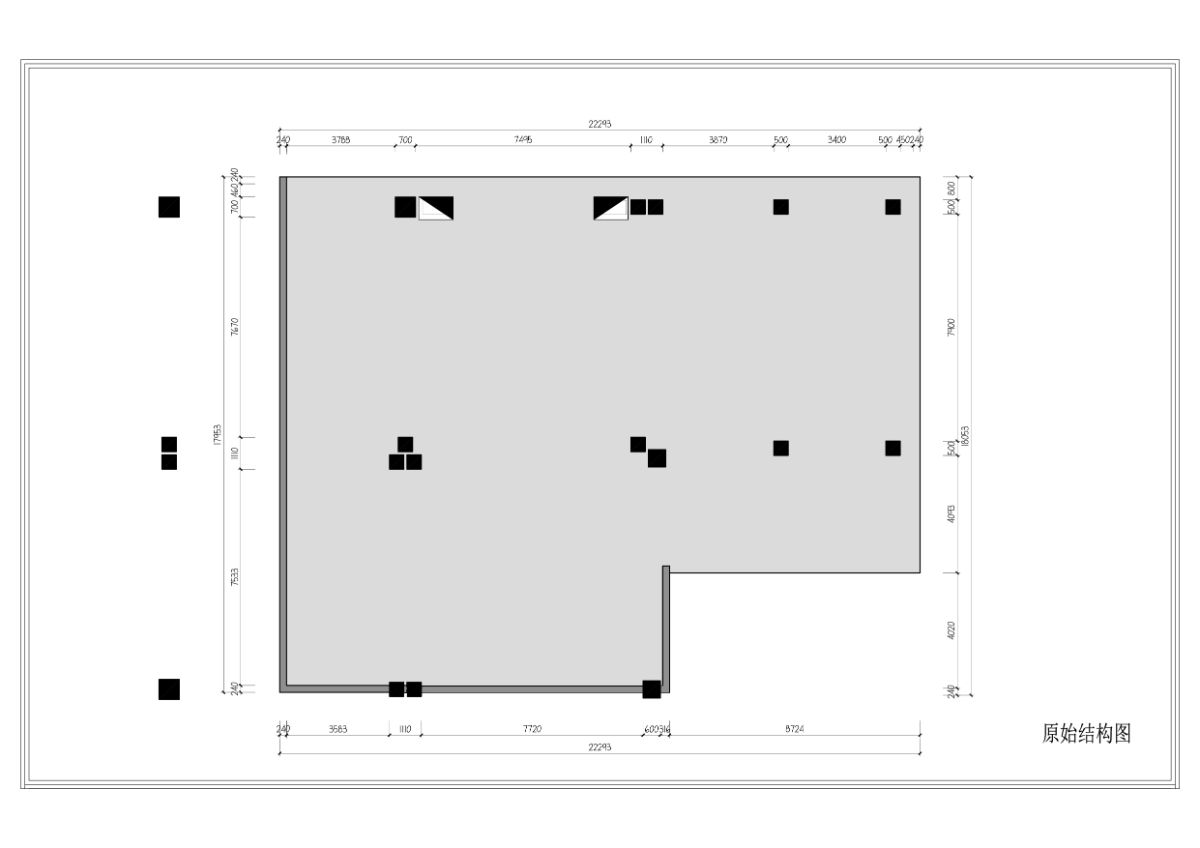
The project is located in the Red Star Macalline Shopping Mall. From the beginning of the design, we reached a consensus with our client that the sales lines are the most important. The most we talked with our client is also about the plan layout and sales lines.
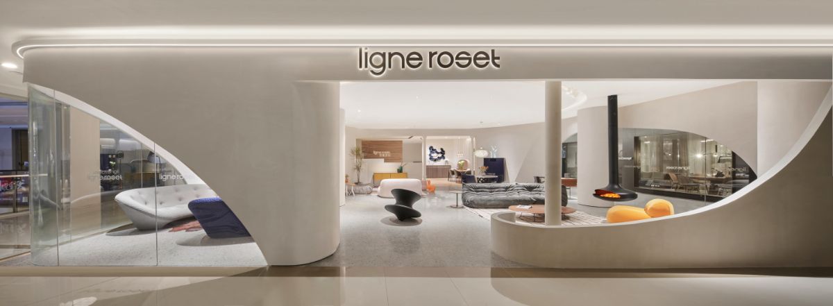
We list in advance the main display products according to the previous sales situation with the client, and then design the plane layout and sales lines according to these products. Located near the main entrance of the shopping mall, the store enjoys a preferable location, and there is the front reception desk of the shopping mall next to it, so this place will undoubtedly become the main entrance of the store. At the same time, we observed the sales of other shops and found that there are other shops nearby that are extremely popular, but not furniture. We also set up an entrance facing that shop to attract more customers.
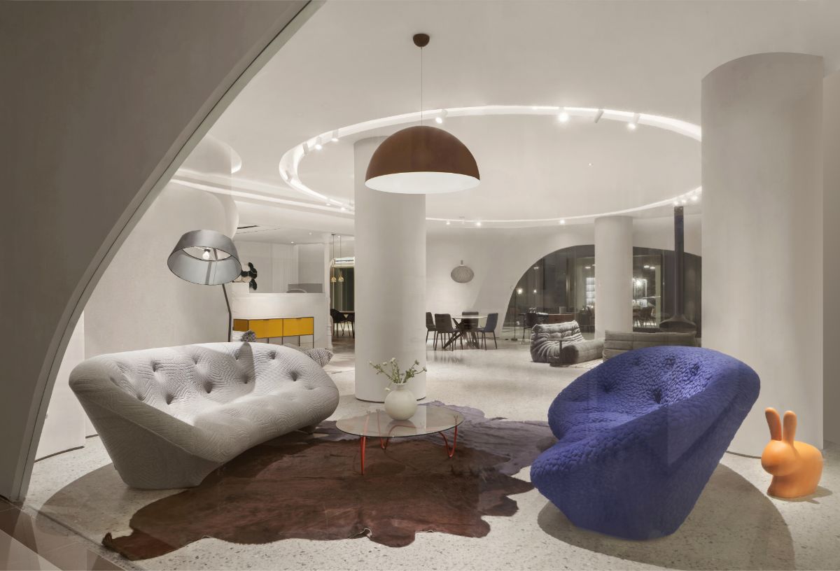
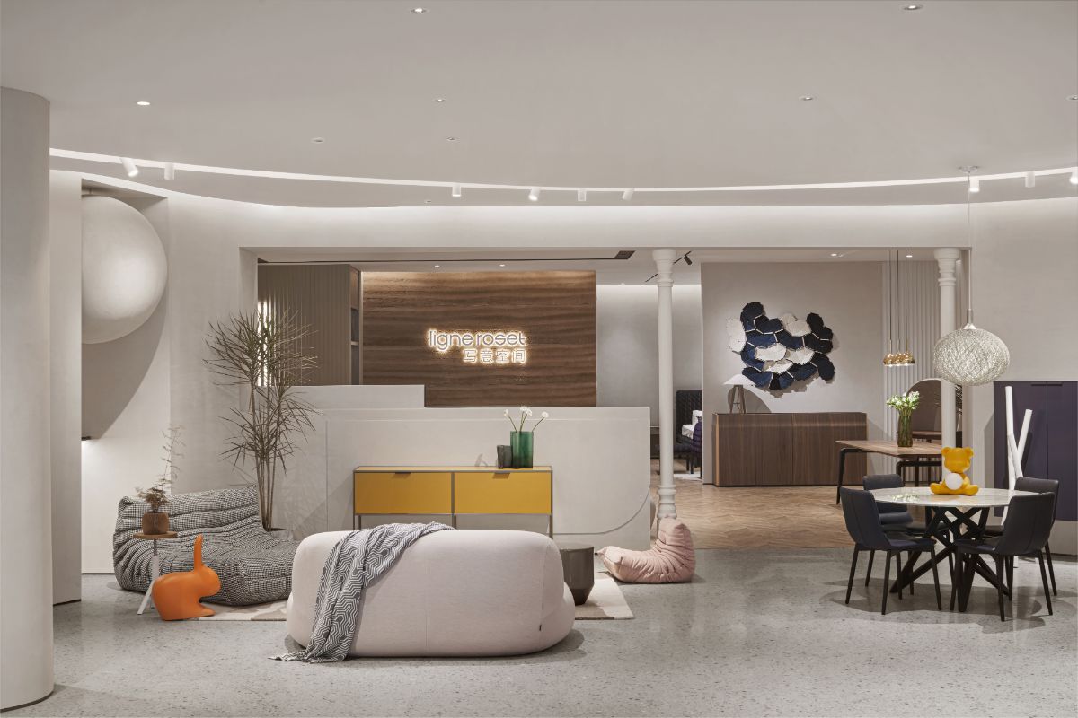
As to the internal store arrangement, we set the route so that the customers can naturally walk to all corners of the store after they enter the store from the entrance to see all products. Our arrangement is to form several small groups, and these small groups are scene simulation. The customers will conjure up immersive associations, the associations about the beautiful effects of their own home.
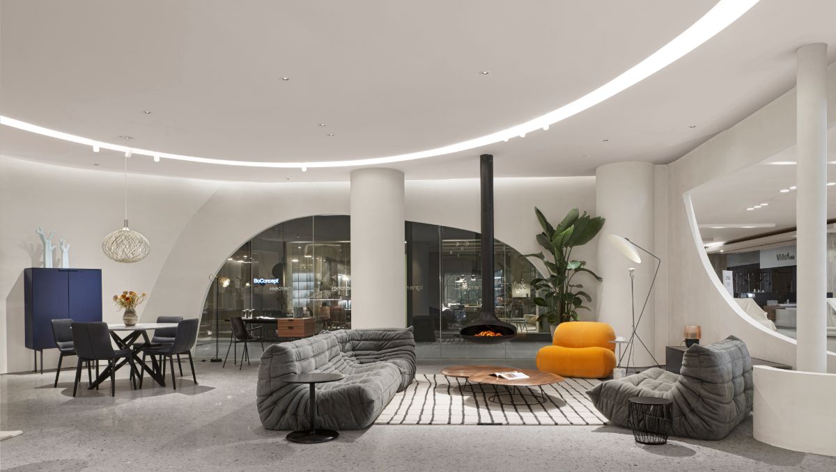
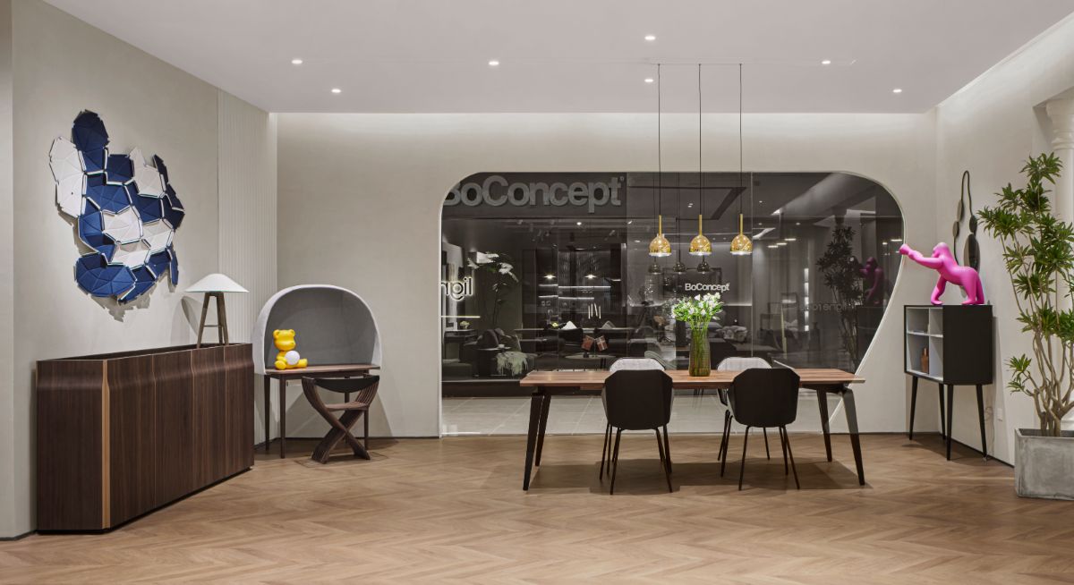
In terms of spatial visual effects, the starting point of the idea is that the product is the protagonist, and the space exists to set off it. We have made several different styles and tones to match different furniture products, so that customers can realize that ligne roset’s products can be used in many spaces with different styles and tones.
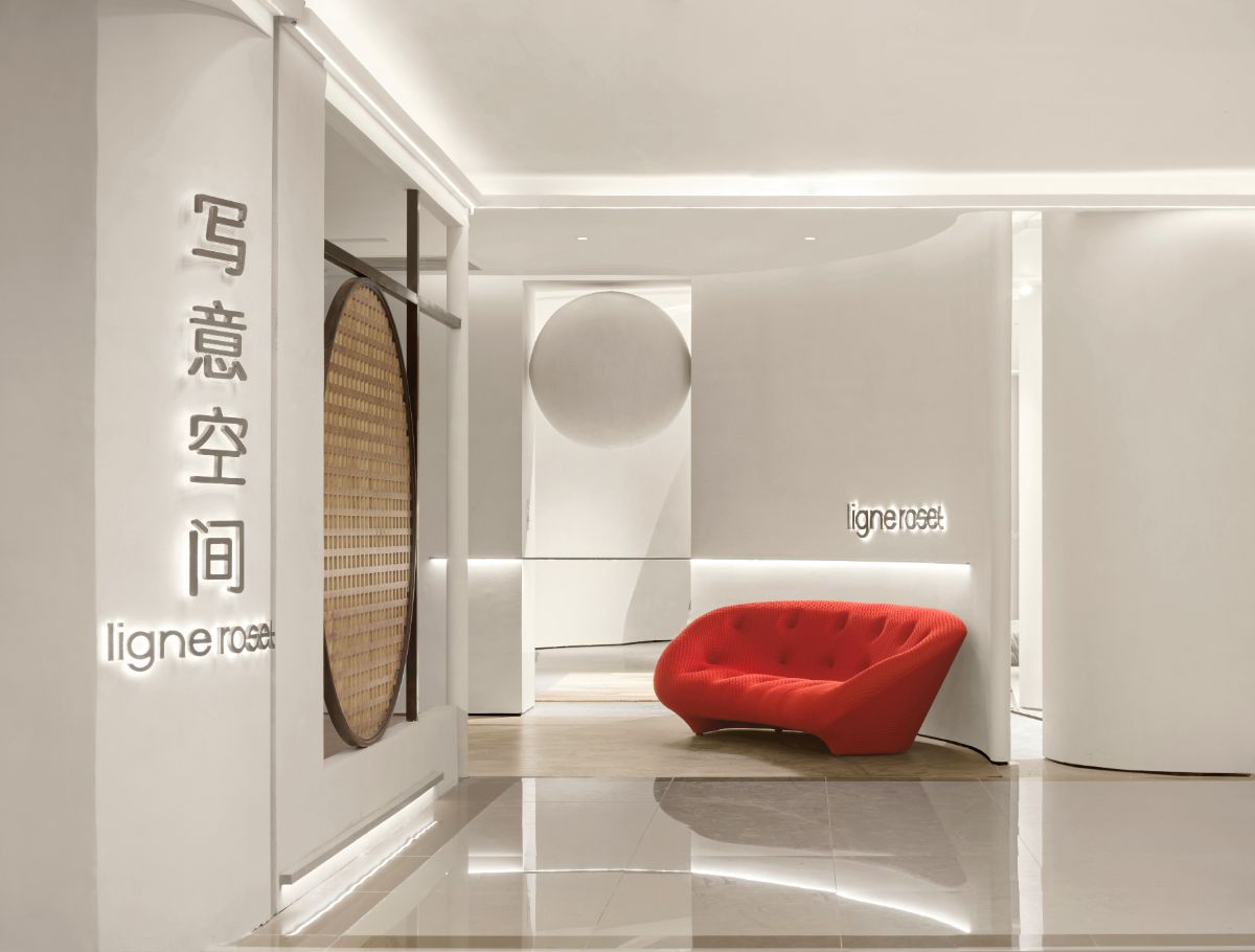
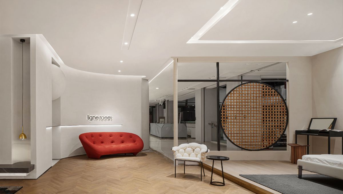
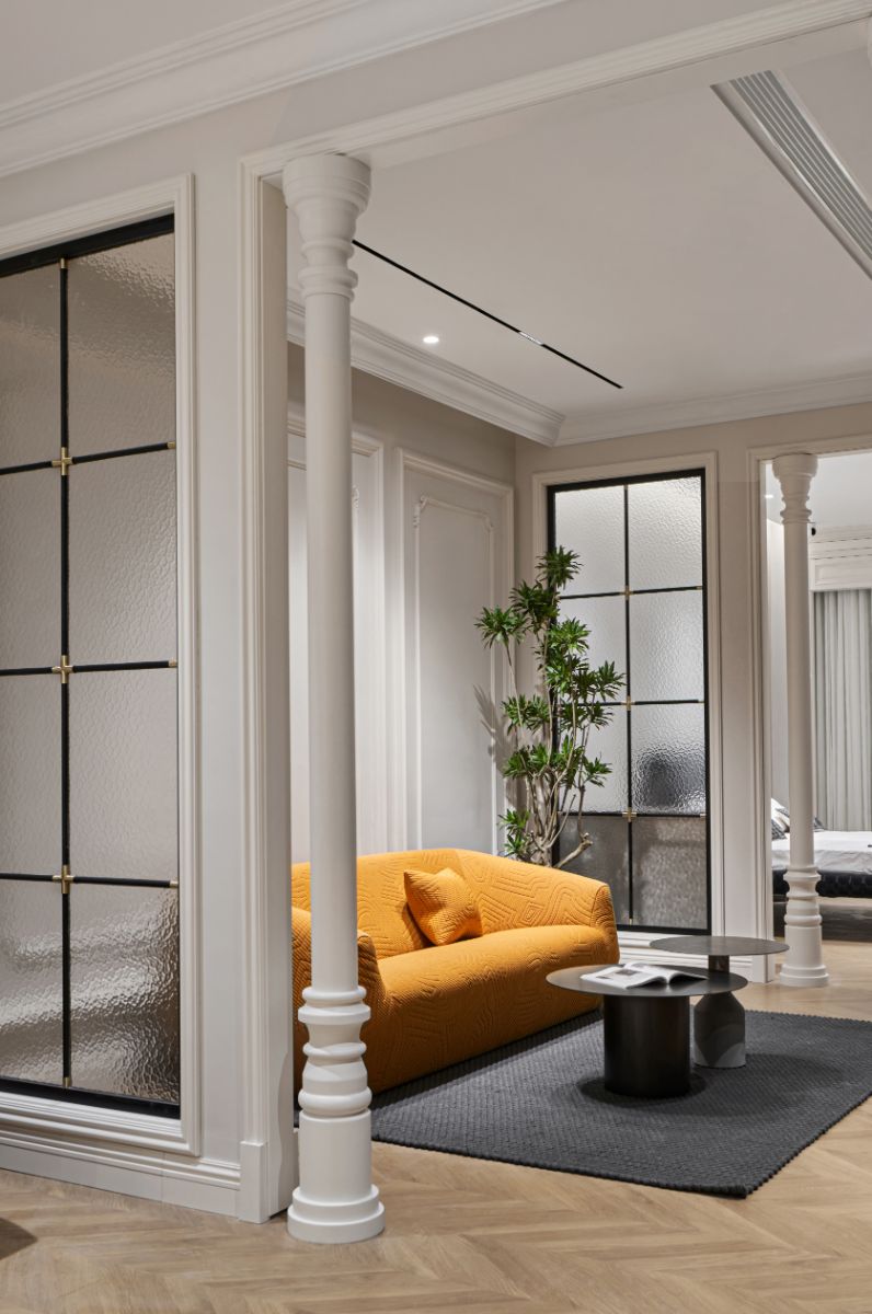
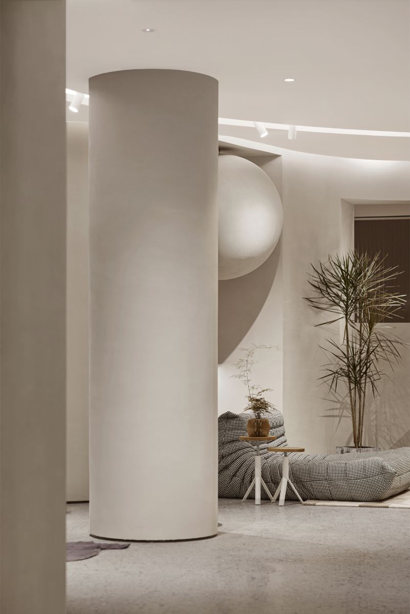
We used several different styles including the Wabi-sabi, Modern, Light Luxury and French style etc. At the most important group at the main entrance, we chose the style of wabi-sabi, because the nearby shops are all exquisite and luxurious in style, we can clearly differentiate from them and attract people’s attention with wabi-sabi style. At the same time, in order to highlight the characteristics of freehand space furniture, we use a lot of curves here. Considering factors such as construction period, cost, construction difficulty, etc., Wabi-sabi style is a suitable choice.
Because there are several different styles, it becomes a very important issue to realize harmonious co-existence and natural transition of these styles. The method we adopted is that the shapes are partially interspersed and the colors are basically unified, so that the problem of harmony is solved perfectly.
